Producing nice manual labels and arrows for ggplot graphs is somewhat obfuscated by the geom_text function. Many code samples refer to this ggplot2 library routine in order to place text at arbitrary positions. However, the fonts look like coming from some 1980s system with 8 bit CPU. For some reason, the much more sophisticated geom_label and annotate graphics routines do not get the attention they deserve. Therefore, this simple demo for label texts.
Moreover, all examples I found for placing arrow pointers into ggplot graphs use “cm” as a unit for arrowheads. But actually, the unit routine accepts “points”, which is why I integrated arrows into this demo.
Complete Sample for Manual Labels and Arrows
The complete sample has multiple variations of labels including the ugly ones painted by geom_text:
# plot multiple time series with legend
# from variables and line types

library(ggplot2)

time <- seq(from=-5,to=5,by=0.01)
sin <- sin(time*10)-cos(time*11)
env1 <- 2*cos(time*.5-pi/4)
env2 <- -env1

tdf <- data.frame(cbind(time,sin,env1,env2))

line_sin <- 'sine'
line_env1 <- 'env 1'
line_env2 <- 'env 2'
legend_name <- NULL

breaks <- c(line_sin,line_env1,line_env2)
colors <- c('blue','green','red')
styles <- c('solid','dashed','dotted')

# custom label function
my_label <- function(x,y,label,color='black') {
	geom_label(data=data.frame(),
	aes(x=x,y=y,label=label),
	color=color,
	size=7,
	label.size=NA)
}

# custom boxed label function
my_boxed_label <- function(x,y,label,color='black') {
	geom_label(data=data.frame(),
	aes(x=x,y=y,label=label),
	color=color,
	size=7)
}

# custom arrow function
my_arrow <- function(x1,x2,y1,y2,color,is_first=TRUE) {
        data <- cbind(c(x1,x2),c(y1,y2))
        data <- data.frame(data)
        colnames(data) <- c('x','y')
        if (is_first) {
		ends <- 'first'
	} else {
		ends <- 'last'
	}
        geom_line(data=data,aes(x=x,y=y),
		  color=color,
		  arrow=arrow(ends=ends,
			      type='closed',
			      length=unit(7,'points')
			      )
	)
}


gg <- ggplot(tdf, aes(x=time,y=sin))
gg <- gg + theme_bw()
gg <- gg + labs(title='Manual Label Demo',
		x='Time', y='Value')
gg <- gg + theme(plot.title=element_text(hjust=0.5,
					 size=20),
		axis.text=element_text(size=14),
		axis.title=element_text(size=18),
		legend.position=c(0.9,0.1),
		legend.text=element_text(size=18),
		legend.title = element_text(size=1))
gg <- gg + geom_line(
			aes(color=line_sin,
		    	    linetype=line_sin)
                    )
gg <- gg + geom_line(
			aes(y=env1,
			    color=line_env1,
		    	    linetype=line_env1)
                    )
gg <- gg + geom_line(
		     	aes(y=env2,
		            color=line_env2,
			    linetype=line_env2)
                    )
gg <- gg + scale_color_manual(name=legend_name,
	        breaks=breaks,
		values=setNames(colors,breaks))
gg <- gg + scale_linetype_manual(name=legend_name,
		values=setNames(styles,breaks))

gg <- gg + my_label(-1.5,1.85,'envelopes','brown')
gg <- gg + my_boxed_label(2,0,'boxed','magenta')
gg <- gg + my_label(2,1,'unboxed','maroon')
gg <- gg + my_arrow(-1.6,-2.5,1.7,1.0,'red')
gg <- gg + my_arrow(-1.4,-.57,1.7,1.0,'green',FALSE)
gg <- gg + geom_text(x=-1.5,y=-1.8,
		     aes(label='ugly text'),
		     size=8)
gg <- gg + annotate("text",x=2,y=-1.2,
		    label='annotate',
		    color='orange',size=8)

print(gg)
dev.print(file="label-demo.png",device=png,
	  width=500,height=500)
The code produces this outcome:
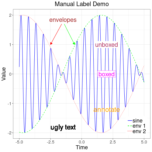
First thing to note is that the function geom_text does not seem to produce presentable results. Though it allows adjusting size and, if need be, turn the fontface even bolder, in my installation the font looks dinosaurish.
geom_text(x=x,y=y,
    fontface=2,
    aes(label='ugly text'),
    size=8)
The much better alternative to geom_text is the annotate function, which just does what it should.
annotate("text",x=x,y=y,
    label='annotate',
    color='orange',size=8)
However, for labels above other graphic content annotate may not be optimal. In order to get a blank rim around label texts, the geom_label functions recommend themselves. But they have the catch that they work on the data series. So absent a specific data frame, they plot themselves in the same spot for as many times as the series has data points. Passing an empty data frame does the trick. Note that “label.size=NA” switches off the box around the rim.
geom_label(data=data.frame(),
	aes(x=x,y=y,label=label),
	color=color,
	size=7,
	label.size=NA)
Finally, the geom_line function is also good for plotting pointer arrows. Most examples have “cm” as a unit, where I keep wondering how big a centimeter should be in a graph of pixels. Using “points” seems more intuitive.
geom_line(data=data,aes(x=x,y=y),
    color=color,
    arrow=arrow(ends=ends,
        type='closed',
        length=unit(7,'points')
    )
)
References
geom_text: rdocumentation.org
geom_label: tidyverse.org
annotate: tidyverse.org